BEHIND THE CREST
BEHIND THE BRAND
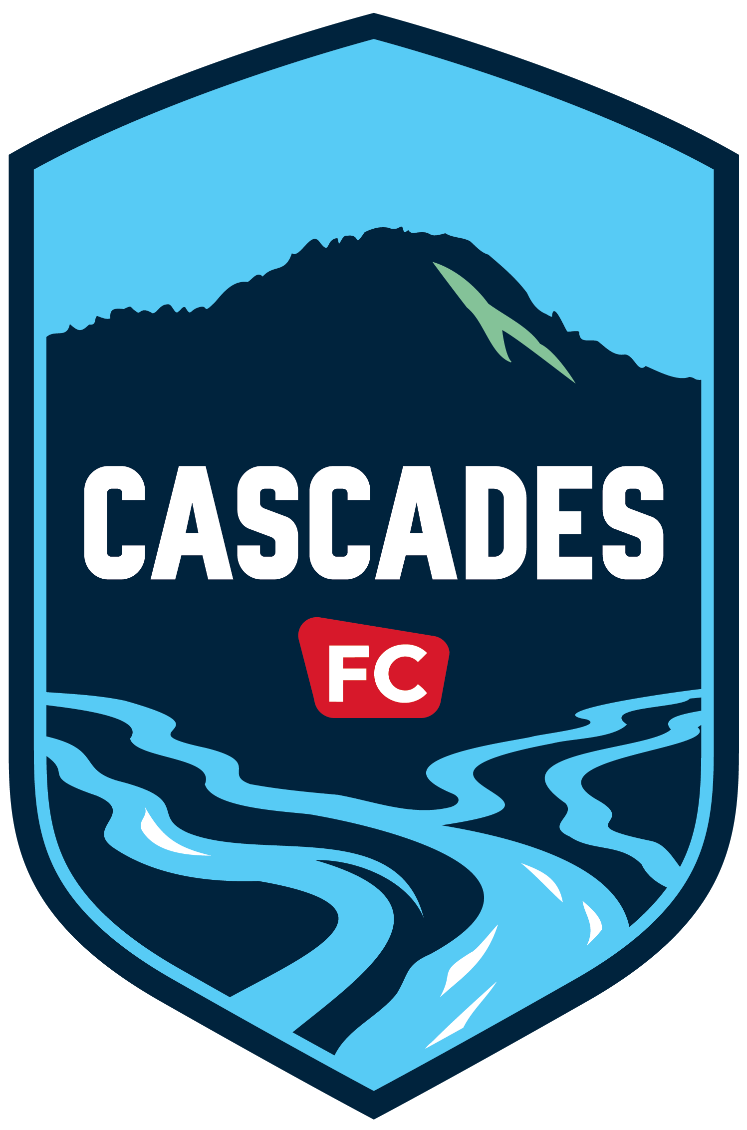
Oregon is a state for inventors and adventurers, for people who take pride in taking the time to do things the right way, with the personal touch. At Cascades FC, we bring that mindset every day, and for us that starts with the most visible part of our club: the crest itself.
Carefully designed in-house by director of design Cassidy Hoban, who has previously designed for Stüssy and worked on the luxury suites at the Dallas Cowboys’ AT&T Stadium; and celebrated artist and writer James Prosek, whose work can be seen at the Smithsonian American Art Museum and who has been featured in People and on NPR’s All Things Considered and NBC Nightly News, our crest echoes the echoes the artisanal look and feel of the pieces our local artists create every day.
Every aspect of the crest is a tribute to the place we call home, from the shape itself to the small nod to Lane United FC contained right in the heart of the design. It was lovingly made for Oregonians who love Oregon, the fans who enjoy spending their weekends exploring the hiking trails and rivers as much as they enjoy spending their evenings at Civic Park cheering for Cascades FC.
A BRAND 30 MILLION YEARS IN THE MAKING
Formed approximately 30 million years ago, Spencer Butte is a 2,058-foot volcanic butte that is part of the Cascade Volcanoes range and towers over the south end of Eugene. It’s the first sign of “home” people see while driving south towards Eugene-Springfield, and its hiking trails are well-known to locals.
The accent within Spencer Butte, providing depth and character to the design, is in a shade of light green that pays homage to the trucks used by the U.S. Forest Service since the 1950s.
The Willamette and the McKenzie Rivers meet just north of Eugene and Springfield, enriching the soil that makes the Willamette Valley one of the most fertile regions in the USA. Indigenous peoples made the area home more than 10,000 years ago, and the famed Oregon Trail ended near where the Willamette River meets the Columbia. Now, the rivers are home to anglers and adventurers alike.
Lane County FC, a former USL League Two team, called Eugene-Springfield home for more than a decade before entering USL League One as Cascades FC. As a nod to the club’s history, the center of our crest is the shape of a U.S. Forest Service sign in LUFC red, with the “FC” in the same font that LUFC used.
The shape of the crest itself is inspired by Lane County’s iconic covered bridges. With 20 such bridges, Lane County has more covered bridges than any other county west of the Mississippi. Seventeen of our county’s bridges are listed on the National Register of Historic Places.
CASCADE NIGHT
A deep, saturated navy that captures the depth of the McKenzie’s pools and the Cascades sky after dark.
GLACIER BLUE
A bright, cold blue inspired by the snowmelt and whitewater that feed our rivers and the clear morning sky.
LUFC RED
The red of the “FC” icon, carried forward from Lane United FC. It represents passion, heritage and the supporters who came before us
FOREST SERVICE GREEN
A fresh mint green that marks the slope of Spencer Butte in the crest — a nod to our public lands